
What would the world look like if we fairly distributed the land to where the people live? Or if the more well off could buy land abroad and move it home? Well, you can!
I was going to write about the results of the survey, but it has proved to be quite popular, and so I will allow more results to come in beforehand.
Instead, I’ll introduce you to a website, the Carbon Map, I came across that allows you to resize the countries by population and wealth.
Of course, if I’m writing about it, there is more to it than that. You can also size countries by the amount of fossil fuels they extract, or the emissions for which they are responsible, both now and historically.
I think the picture below illustrates my point that the poorest countries, less able to cope with the scourge of a changing climate, have hardly any emissions, compared with the highest emitting countries, which are also the richest.
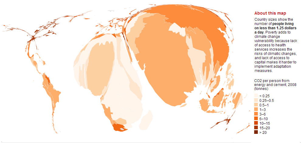
If emissions are going to come down quickly enough, we need to address that inequity. The richer countries, and the people in the richest countries, need to reduce our emissions. The only way we can do that quickly enough is if we reduce our energy use.
On a related note, here’s a little video showing other information about the decades to come on a revolving globe:
John Bell,
Ordinary bloke
